WWE Changes “Great Balls Of Fire” Logo To Be Less Cocky, Just As Ballsy

WWE has changed the logo of upcoming “Great Balls of Fire” PPV and now it looks slightly less pornographic.
Welcome to another edition of
OFF-TRACK with A-TRAIN
where we took at two versions
of a PPV logo and decide
which one looks less like
a penis and testicles
in this episode
GOODNESS GRACIOUS
THE BALLS CONTINUE TO BE ON FIRE
So.
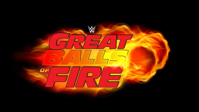
Remember the old Great Balls of Fire logo?
The one that looked exactly like a cock and balls?
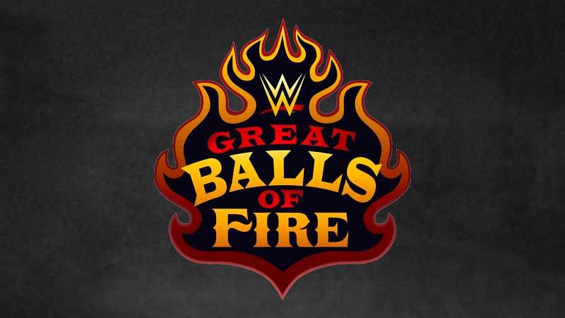
Well someone talked with Vince, and they changed it.
Wow.
That’s still pretty ballsy.
Less cocky though.
Here. Let’s see them back to back.
![]()
Shrinkage is a hell of a thing, man.
By the way, this is technically the fourth option as a logo for the show.
These two were considered …

… but they didn’t have literal balls made out of literal fire, so they were rejected.