32 Years of SummerSlam Posters
Last year I asked Sean Ross Sapp if I could write an article about the best and worst WWE PPV theme songs. I always appreciated the fact that he gave me an outlet to share my thoughts and opinions. In the time since, I’ve continued contributing to Fightful, transitioning into film reviews and news stories when need be. The site has been a dream, allowing me to combine my passion for wrestling and cinema. I’m always searching for new ways to explore their shared connections, and with SummerSlam this weekend, one immediately jumped out at me.
They say everyone has their vices, for me, it’s movie posters. I have a small collection that I cherish, my favorite of which is a Mad Magazine style one-sheet of Robert Altman’s The Long Goodbye. The art form has taken a hit in recent years with lazy digital designs that are indistinguishable from one another. Also, am I the only one who noticed that every piece of marketing is utilizing a yellow and blue color palette? Nevertheless, when done well, a poster should evoke the spirit of its subject. Not only that but much like album covers, I still believe that they contribute to the overall experience.
There have always been promotional posters for wrestling events, but I can’t remember ever being wowed by one. I see so much outstanding fan art online that it’s hard to feel anything but disheartened when WWE releases their “professionally” rendered version. It’s too bad because there are probably a lot of people who would want to commemorate their favorite events by hanging a print on their wall.
For this article, I wanted to take a look at every SummerSlam poster (all images via WWE) and share my rankings. Please remember, it’s all subjective. I’m not going to give a big writeup on each one, but what I’m generally looking for are style and story. Aesthetically, would it grab my attention if I saw it in my local theatre, on a billboard, or even as a pop-up ad? Lastly, does it tell me anything about the event and what I might expect to see, either narratively or tonally, if I was to tune in? Hopefully, I’m not alone in my geekdom, and you find some enjoyment out of this exercise as well!
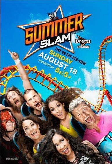
#32. SummerSlam 2015
Thoughts: There is no way that this took more than 10 minutes to make, and it shows. You’ll notice that the next few images on this list are all similar. In my mind, it’s more of a last-place tier than anything. They’re all awful. It feels obvious, so I’m not going to say anything more.
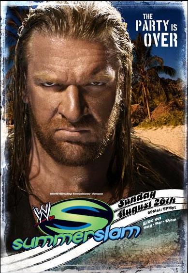
#31. SummerSlam 2014
#30. SummerSlam 2018

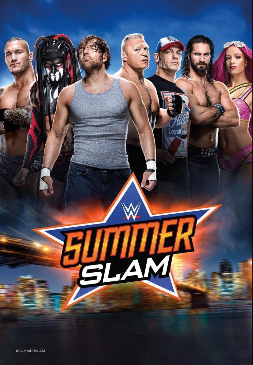
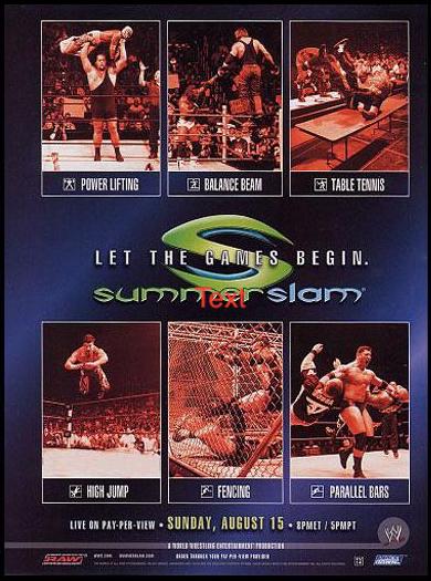
#29. SummerSlam 2016
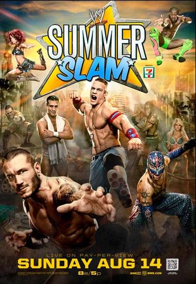
#28. SummerSlam 2012
#27. SummerSlam 2007
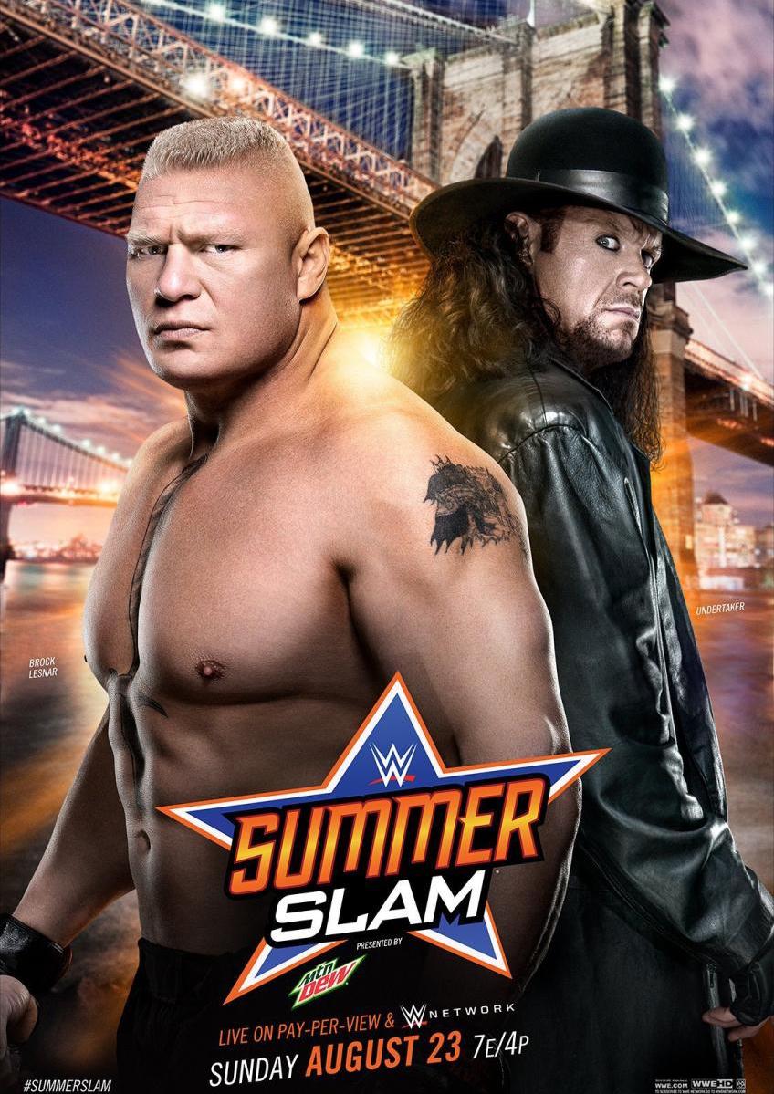
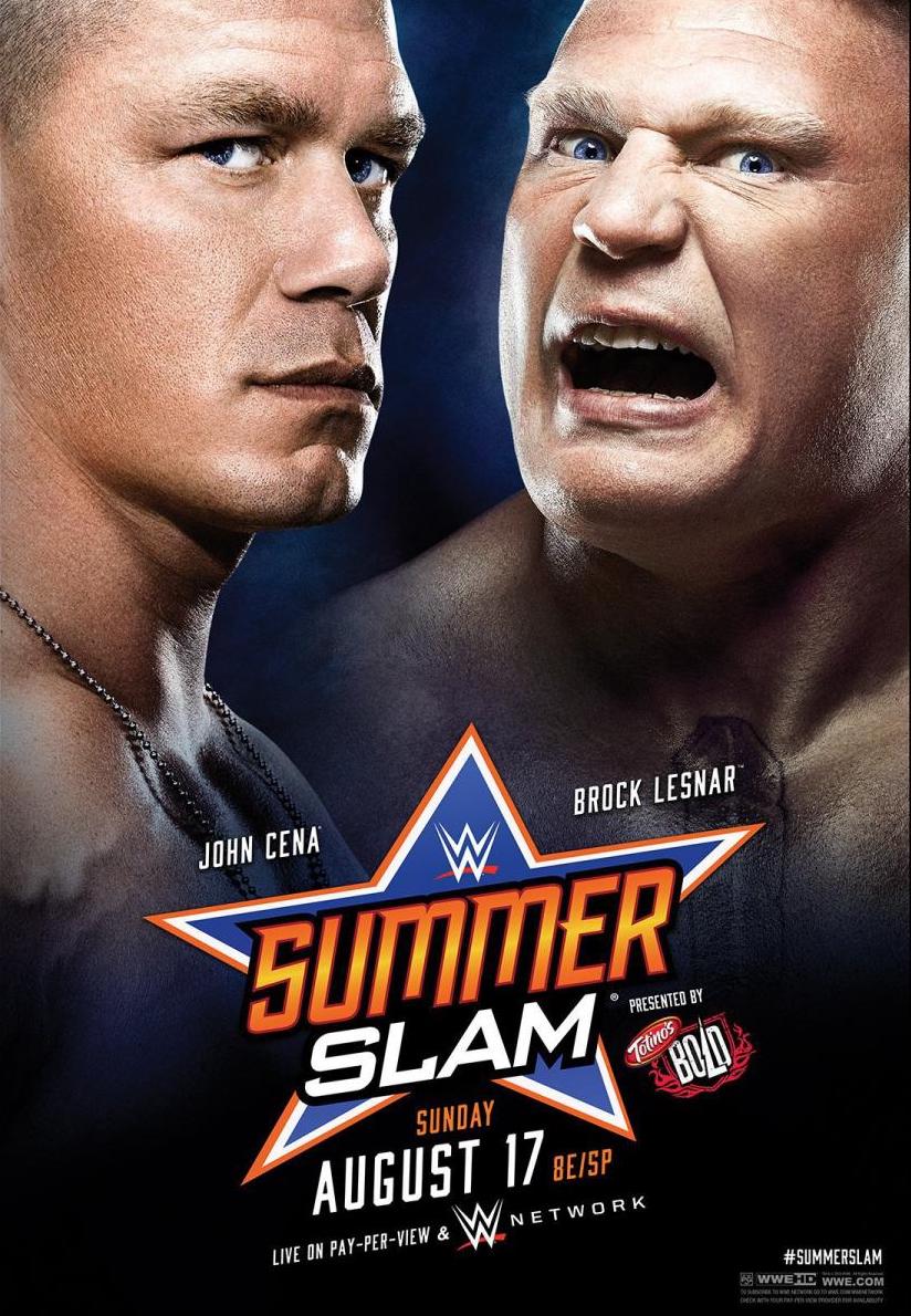
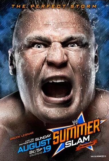
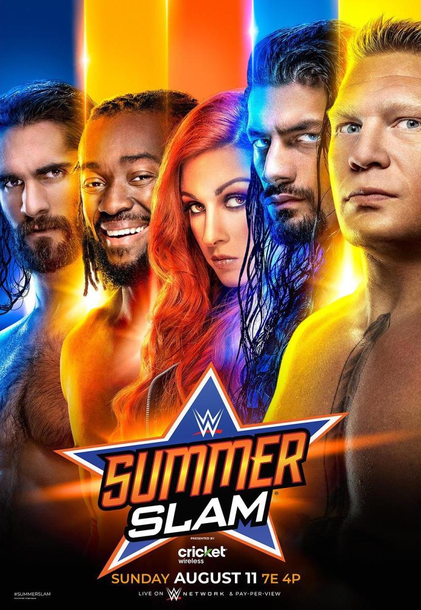
#26. SummerSlam 2019
#25. SummerSlam 2011
Thoughts: While an upgrade from the close-up headshot images, it remains drab. Maybe it would have worked better as a variant cereal box?
#24. SummerSlam 2010
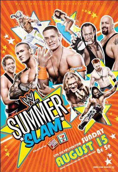
Thoughts: Nicely done utilizing those complementary colors. Someone paid attention in grade school.
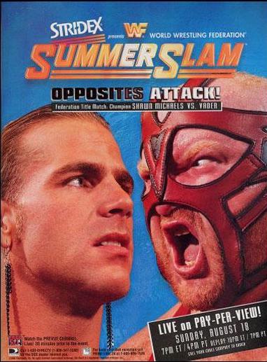
#23. SummerSlam 2017
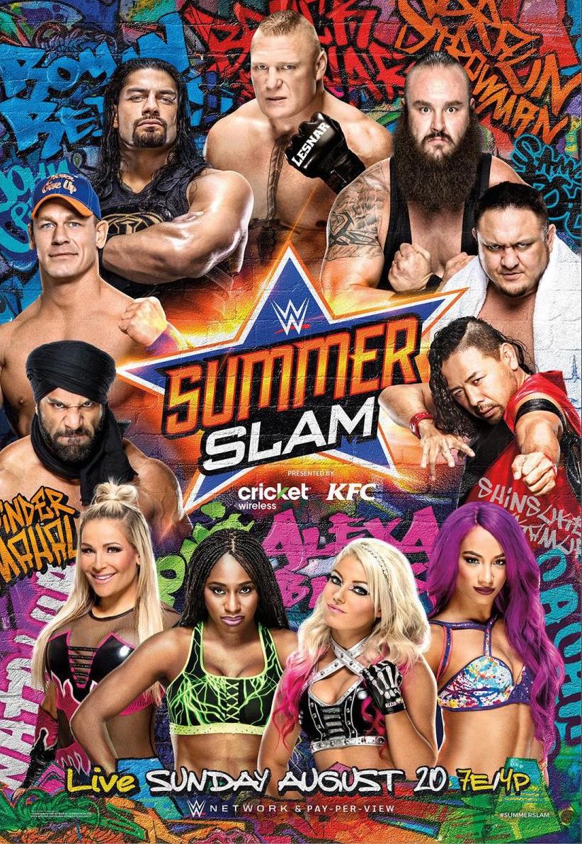
Thoughts: I like the idea of a graffiti poster, and while this doesn’t follow through fully, the fact that it made me want to brainstorm ideas for what it could have been is enough to earn it some brownie points.
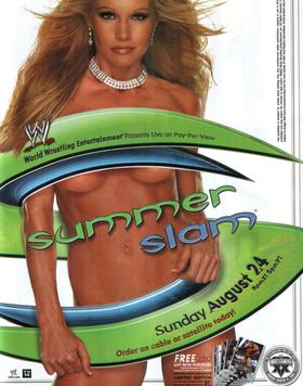
#22. SummerSlam 2005
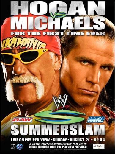
Thoughts: I don’t like this poster, but whether you like it or not, Hulk Hogan is still a recognizable face and the allure of a “first time ever” match is intriguing enough to at least consider checking out. That said, both men look old in this picture, so I’m not sure how enticing that really is.
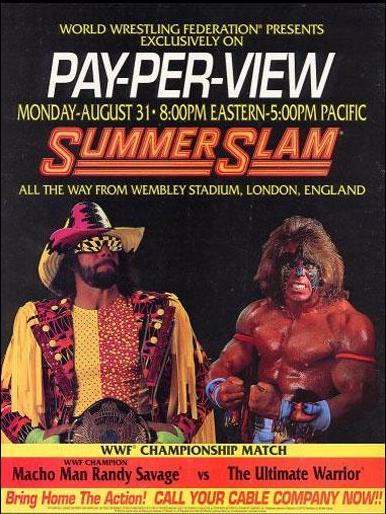
#21. SummerSlam 1995
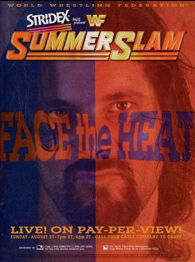
Thoughts: What the hell were they going for here? Are the distorted letters supposed to mimic the blurred vision during a heat stroke? It’s so bizarre! I need to find out what the art department was thinking. I’m borderline computer illiterate, and I’m pretty sure I could have put this together. Just, wow.
To clarify, I have it this high because of how fascinated I am by it.
#20. SummerSlam 2008
Thoughts: 2008 and 2013 are both going for the summer fun vibe. Generally, I think that’s a good idea.
#19. SummerSlam 2013
#18. SummerSlam 2003
Thoughts: WWE left this one off of their website, and I understand why. I’m not sure what I’d think if I saw this in public, but I’m guessing it wouldn’t be wrestling. Also, it’s a tad risqué to display in your home.
#17. SummerSlam 1992
Thoughts: Nothing special to see here, but the two larger than life figures make it better than it has any right being.
#16. SummerSlam 2006

Thoughts: Imagine the weirdest pool party ever. That’s what this poster is pitching, replete with too old to be cool dick-joke guys, beautiful women, and that one guy who always jumps in the pool alone. It’s WWE’s attempt to attract the teen comedy crowd.
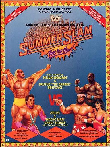
#15. SummerSlam 1990
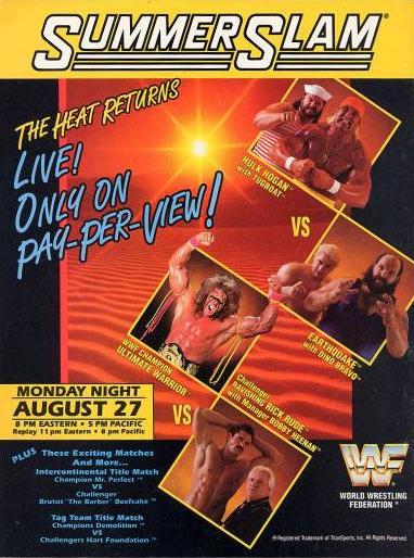
Thoughts: Inoffensive and forgettable, but still better than those behind it.
#14. SummerSlam 2004
Thoughts: Linking yourself to the Olympics is smart, and while I think the event comparison is clever, it could have been done with a lot more panache.
#13. SummerSlam 1988
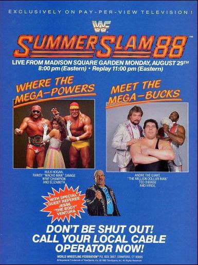
Thoughts: I love the color and design of the title. Adding the year is a nice touch. It makes it more commemorative. I also like the build-up of the match. Everyone involved had permeated the pop culture, which instantly adds an air of significance around it.
#12. SummerSlam 2009
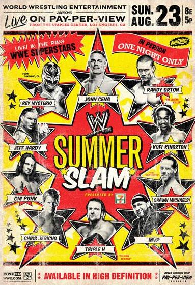
Thoughts: Easily the best of the modern, “let’s showcase as many people as possible style posters.” The retro look along with the yellow backsplash go together perfectly.
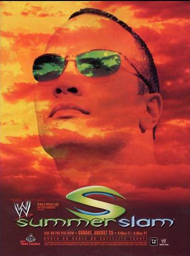
#11. SummerSlam 2001
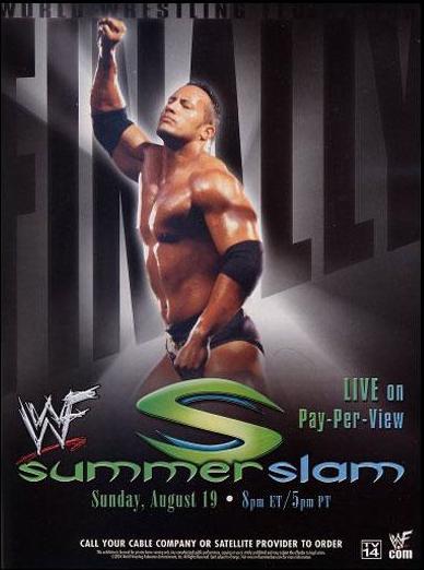
Thoughts: I decided to lump all of The Rock‘s posters together. He is the most transcendent star to ever emerge from the WWE, and it was a smart idea to put him front and center whenever possible. 2000 teases fractured relationships and a whole lot of hate, while 2002 made me think of The Lion King. It makes no sense, but it looks terrific.
#10. SummerSlam 2000

#9. SummerSlam 2002
#8. SummerSlam 1996
Thoughts: I’ve been ragging on this style of poster, but there was something about this one that grabbed my attention and never let go.
#7. SummerSlam 1989
Thoughts: I absolutely love the arcade-style characters and the reverberating effect on the title.
#6. SummerSlam 1994
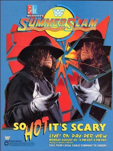
Thoughts: The duality of the image, one-half whole and the other shattered looks fantastic.
#5. SummerSlam 1991
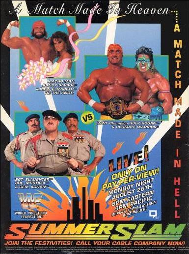
Thoughts: Who wouldn’t want to celebrate a wedding and then watch a match made in hell?
#4. SummerSlam 1993
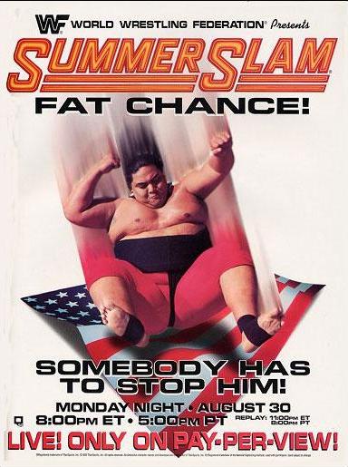
Thoughts: Calling the champion fat might not have been the best decision, but I do appreciate the fact that you can feel the panic in their “somebody has to stop him” plea. The visual of him coming down on the American flag is striking and tells a very clear story.
#3. SummerSlam 1998
Thoughts: The imagery wouldn’t hold up today, but if I saw this in 1998, they would have sold me a ticket. It’s larger than life destruction in the mold of Kong or Godzilla, which is right up my alley.
#2. SummerSlam 1999
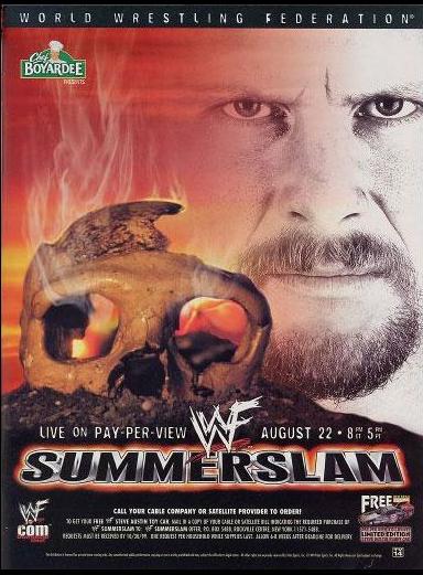
Thoughts: The skull, the smoke, the red sky, and the look in Austin’s eyes are enough to hook me. The tone has been set and it does it with a tangible intensity.
#1. SummerSlam 1997
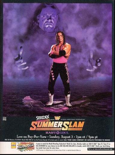
Thoughts: My first thought was that Undertaker was playing the role of Vader in The Empire Strikes Back‘s poster. He’s a looming and foreboding presence, and Bret Hart is in grave trouble. The purple is gorgeous and sucks you into the darkness of this character. If I wasn’t a wrestling fan and saw this image, I’d have to find out the full story.